Yete
a partnership between educators, government and business representatives. Its purpose is to address Wairarapa’s high levels of NEETS - young people who are Not in Education, Employment or Training.As part of a rebrand and new communication strategy, YETE needs a new logo and visual language that portrays its mana, strength and integrity. It should be youth-focused, with energy and vibrancy, yet the brand needs to simultaneously appeal to local businesses who can get onboard and support futures and pathways to success.
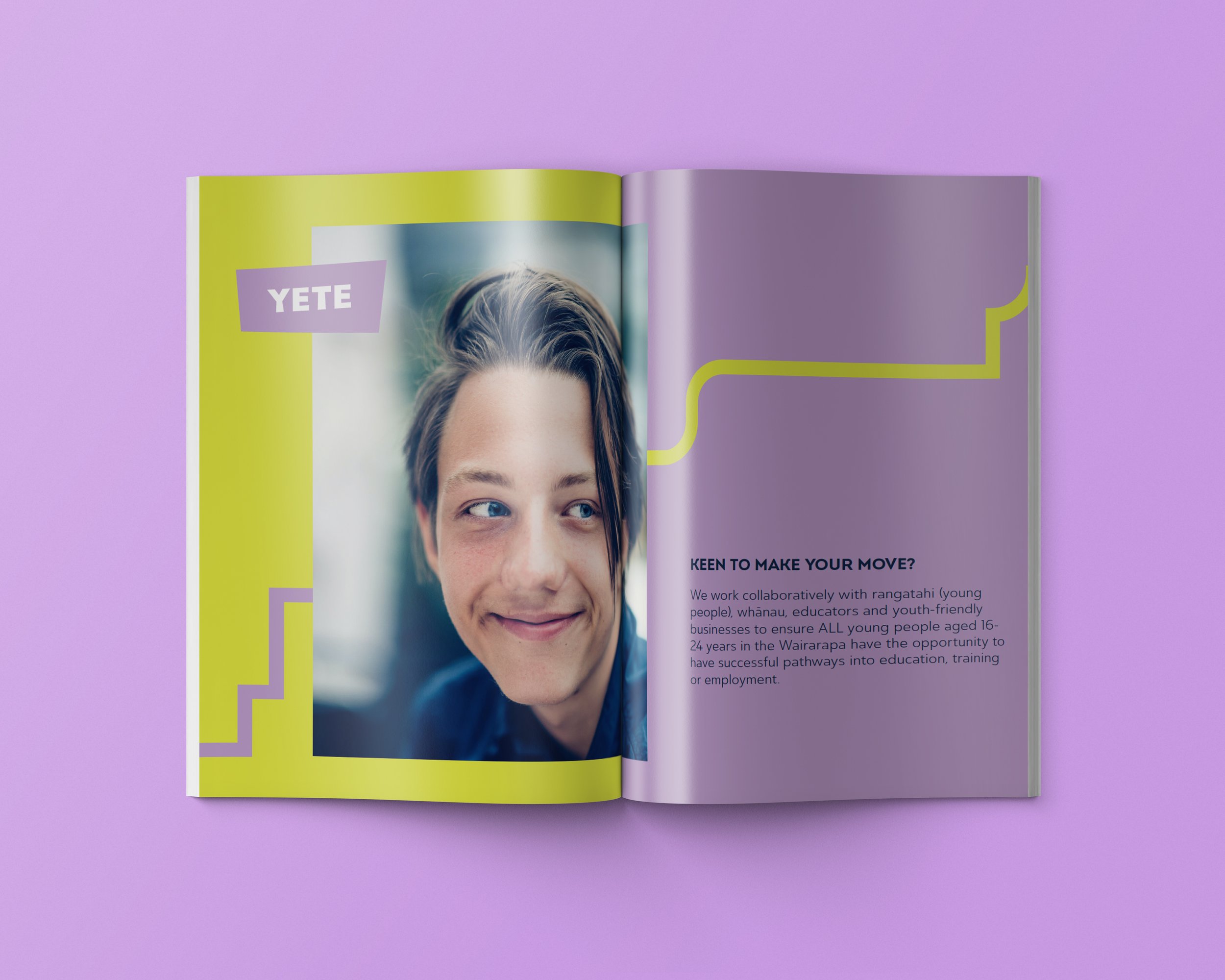
YETE has two key audiences that it needs to engage with and inspire. The first is a professional audience - local businesses, education providers, and government agencies, so the brand needs to have integrity and professionalism. The second audience is Wairarapa’s rangatahi and their whānau. Typically, these secondary audiences will be targeted directly by the programmes and events YETE runs, such as the Year 11 Industry Big Day Out, the Job Club, or Licence 2 Work.
Providing a bridge, or link, between these two key audiences is at the heart of YETE, and this should be portrayed in the brand design language
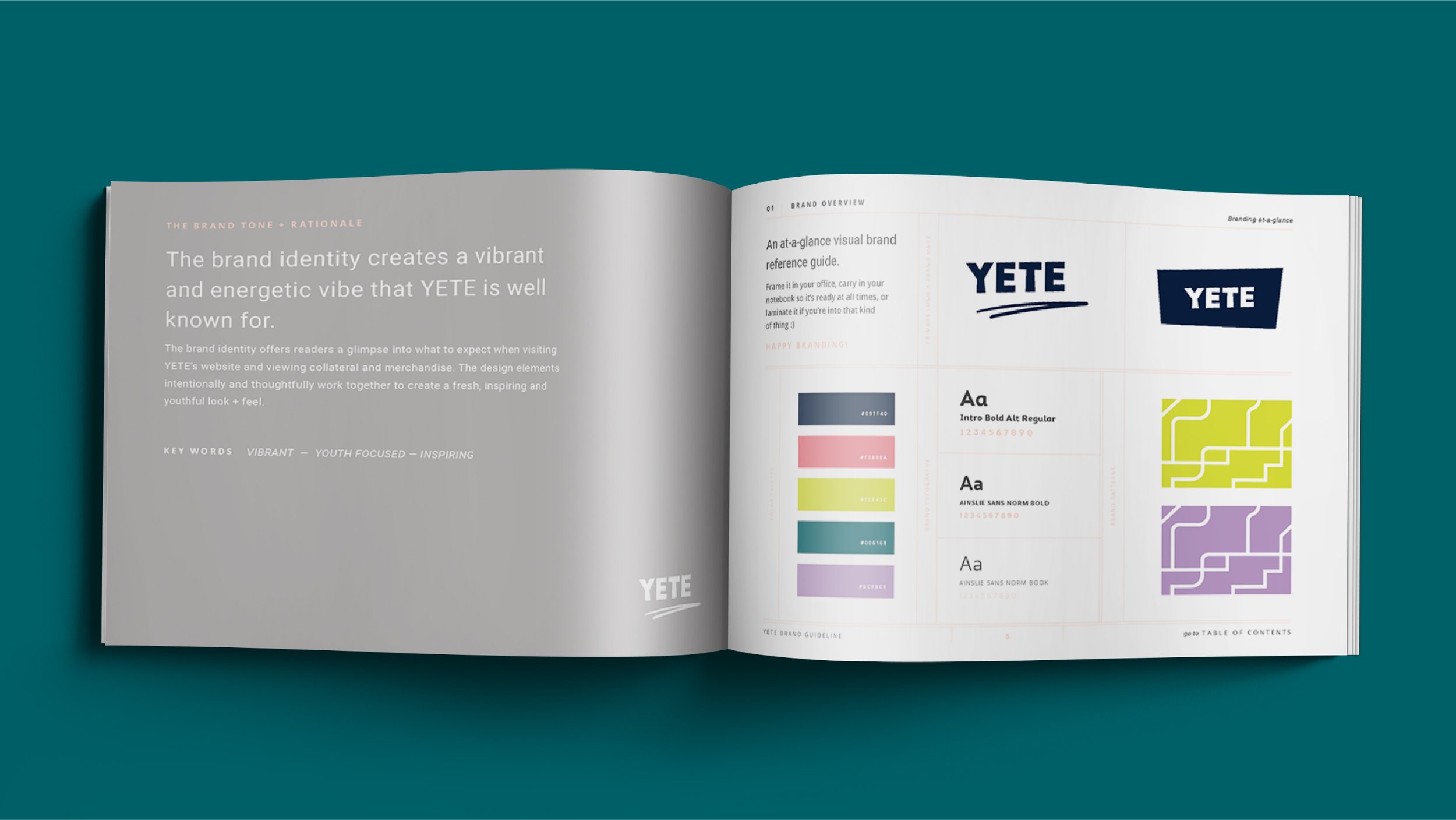
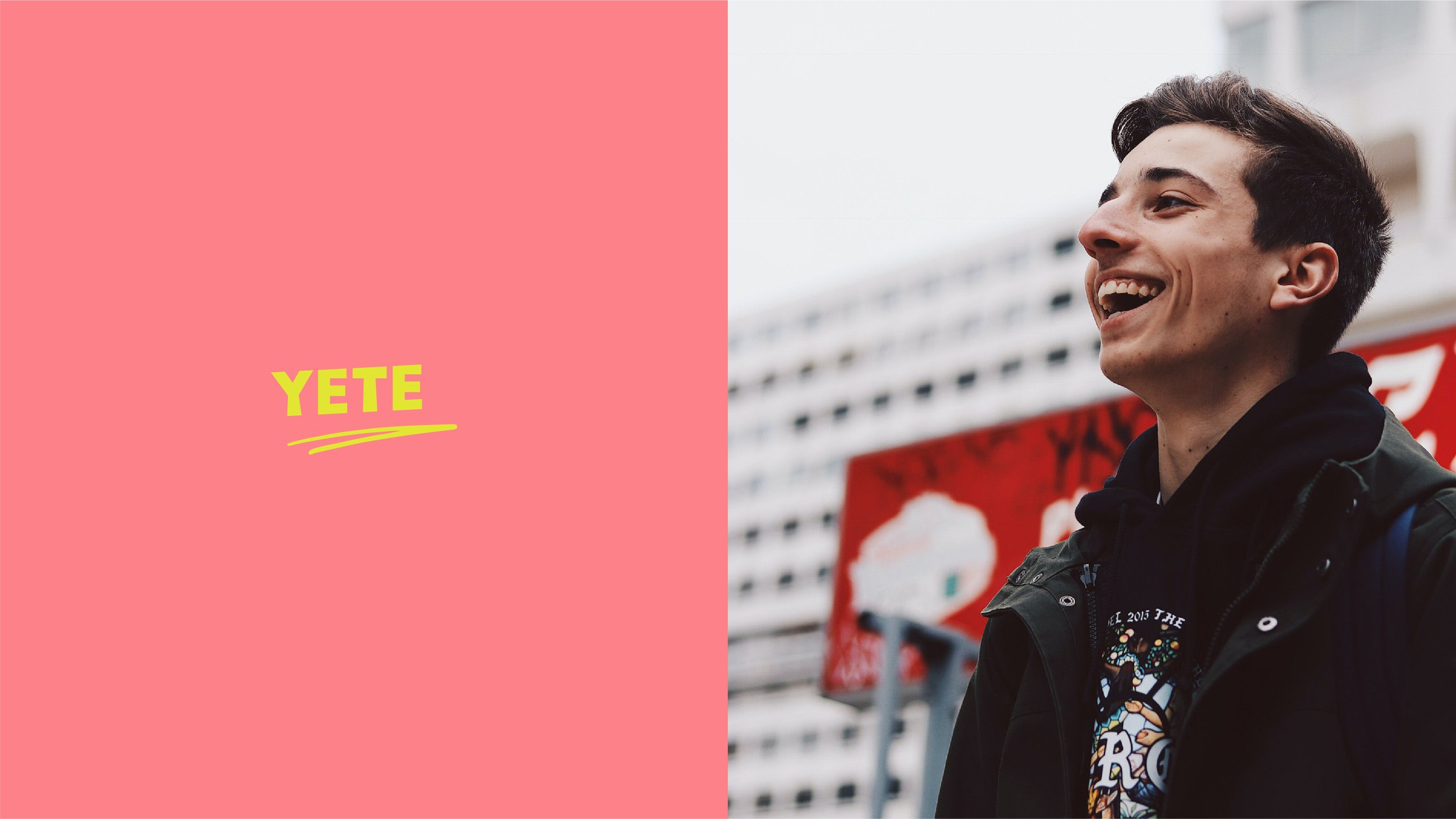
YETE’s new brand identity is bright, bold, engaging. It is youth-focused through its bright colours and dynamic linework, while simultaneously maintaining a clean and professional aesthetic which will appeal to a professional audience. The primary logo for YETE is a clean wordmark. It features slight unexpected angling of letter forms, which together angle upwards, referencing
success. It is underlined as though with a pen; two lines which also angle upwards and which become one - a nod to the two paths of businesses and youth coming together for a common goal of success. The organic line gives the brand a youthful feel (reminiscent of street art or scribbles).
The secondary logo comprises the monogram housed in a dynamic solid form, which is useful for overlaying over imagery or text, or for merch such as stickers or tote bags. Stepped linework creates a versatile graphic element / pattern - representative of various pathways to success. These are wiggly lines that follow different paths; no person’s path to success looks the same. This pattern can be used across multiple media, especially collateral to be used in conjunction with imagery and blocks of text.
YETE’s new colour palette is vibrant and fresh; comprising a navy which ties the organisation into its parent brand, REAP. The remaining 4 bright colours can all be used in varying capacities and combinations to keep the brand fresh and dynamic.
DELIVERABLES
Brand Strategy.
Identity Design System.
Graphic Design.
Digital Design.
Marketing Collateral.